Fixing a Hidden Friction Point in Payments
Eliminating redundant confirmations to create a more predictable, user-friendly bottom sheet interaction.
Role
Product Designer
Date
June'25
Duration
1 week

Overview
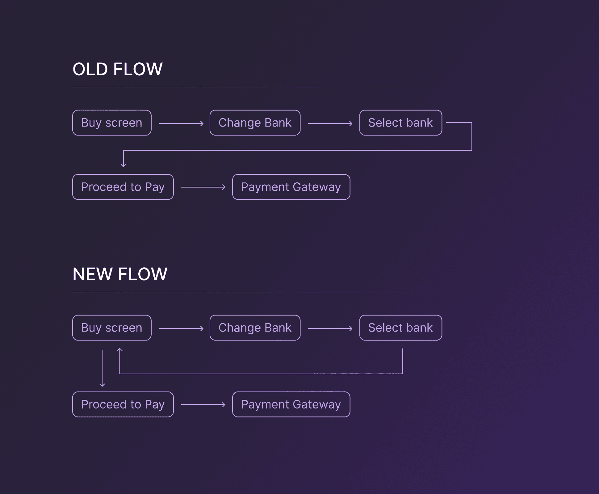
In my initial projects as a product designer, I worked on multiple platform-level initiatives, one of which focused on standardising and templatising bottom sheets across the app. While auditing existing bottom sheets, I identified usability issues in the Select Payment Method bottom sheet a core flow within the app.
Audit Findings
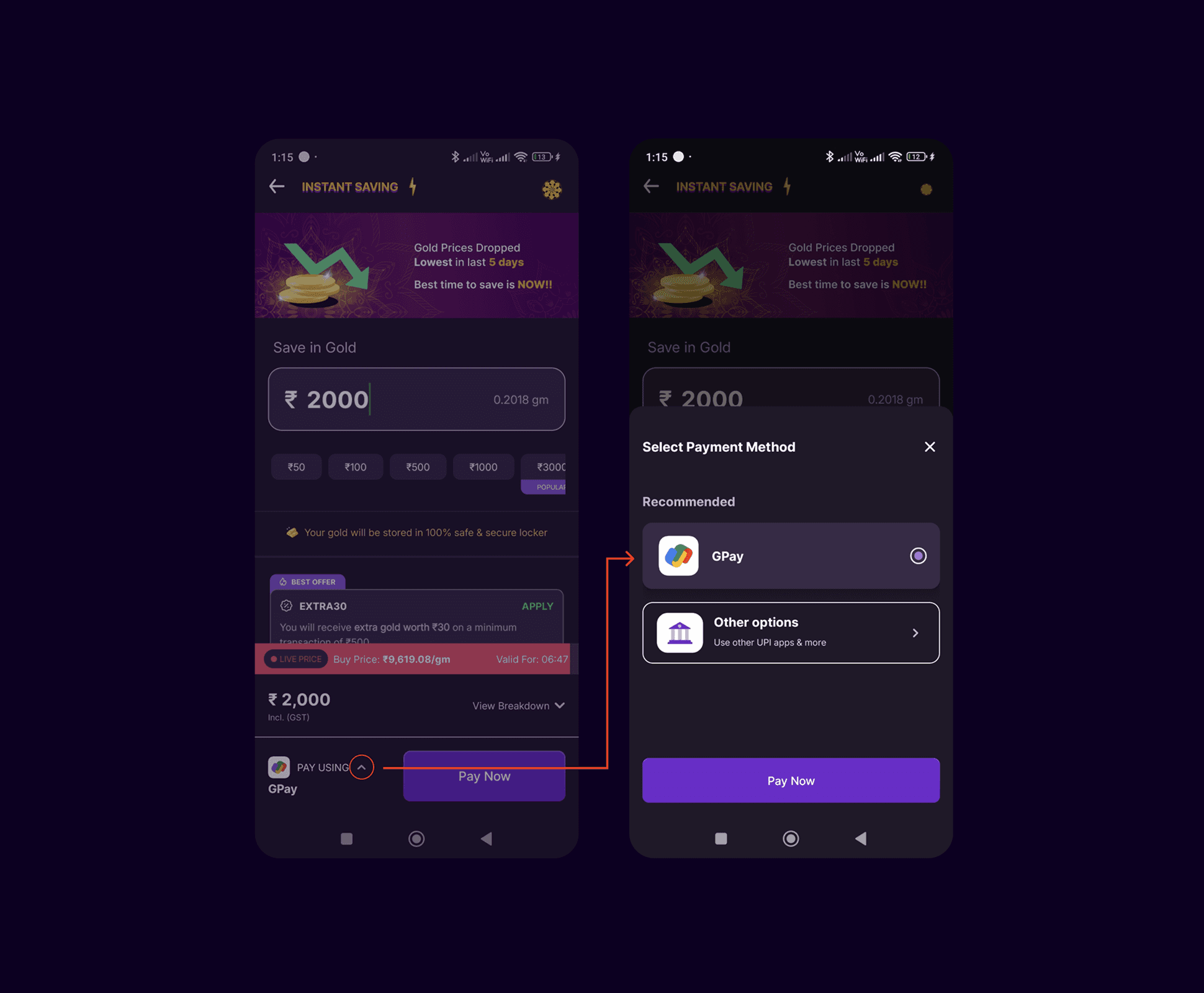
Users had to select a bank and confirm via a CTA within the bottom sheet
The confirmation action immediately redirected users to the payment gateway
Users were given no opportunity to review or edit the amount
The flow introduced unnecessary friction in a critical payment moment. Overall, the experience reduced user control and predictability.
Solutioning
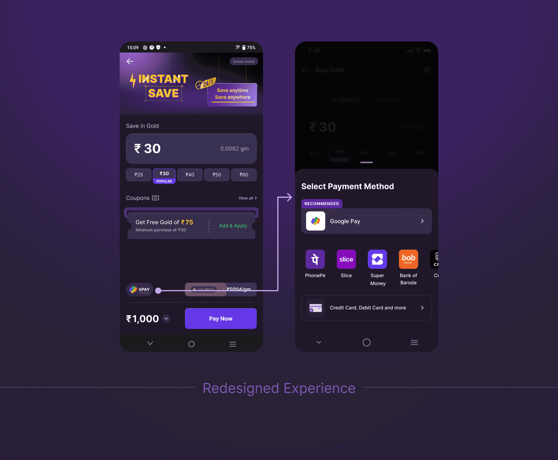
I redesigned the interaction to align with expected bottom sheet behaviour and reduce friction. In the updated flow, tapping the preselected bank opens a bottom sheet listing all available bank options. Once a user taps on a bank, the selection is instantly applied and the bottom sheet dismisses automatically, returning the user to the buy screen.
This allows users to:
Review or edit the transaction amount
Proceed to payment only when read
Impact
Reduced interaction steps in a critical payment flow
Eliminated forced navigation to the payment gateway
Improved clarity, control, and predictability for users
Aligned bottom sheet behavior with platform standards
Other projects

Crafting a Cohesive and Scalable Icon System
Creating visually & optically balanced, intuitive icons that strengthen the product’s overall design language and improve consistency

Redesigning the KYC Experience to Drive Higher Completions
A flow enhancement experiment that boosted KYC attempt rates by ~8.5% and increased end-to-end completion by ~3%.