Redesigning the KYC Experience to Drive Higher Completions
A flow enhancement experiment that boosted KYC attempt rates by ~8.5% and increased end-to-end completion by ~3%.
Role
Product Designer
Date
July'25
Duration
1 week

Overview
KYC was primarily completed at withdrawal, creating unexpected friction during a critical money moment and leading to user drop-offs.
Goal: The objective was to reduce drop-offs and improve KYC funnel conversion by strengthening non-withdrawal entry points, while shifting the experience from reactive to proactive.
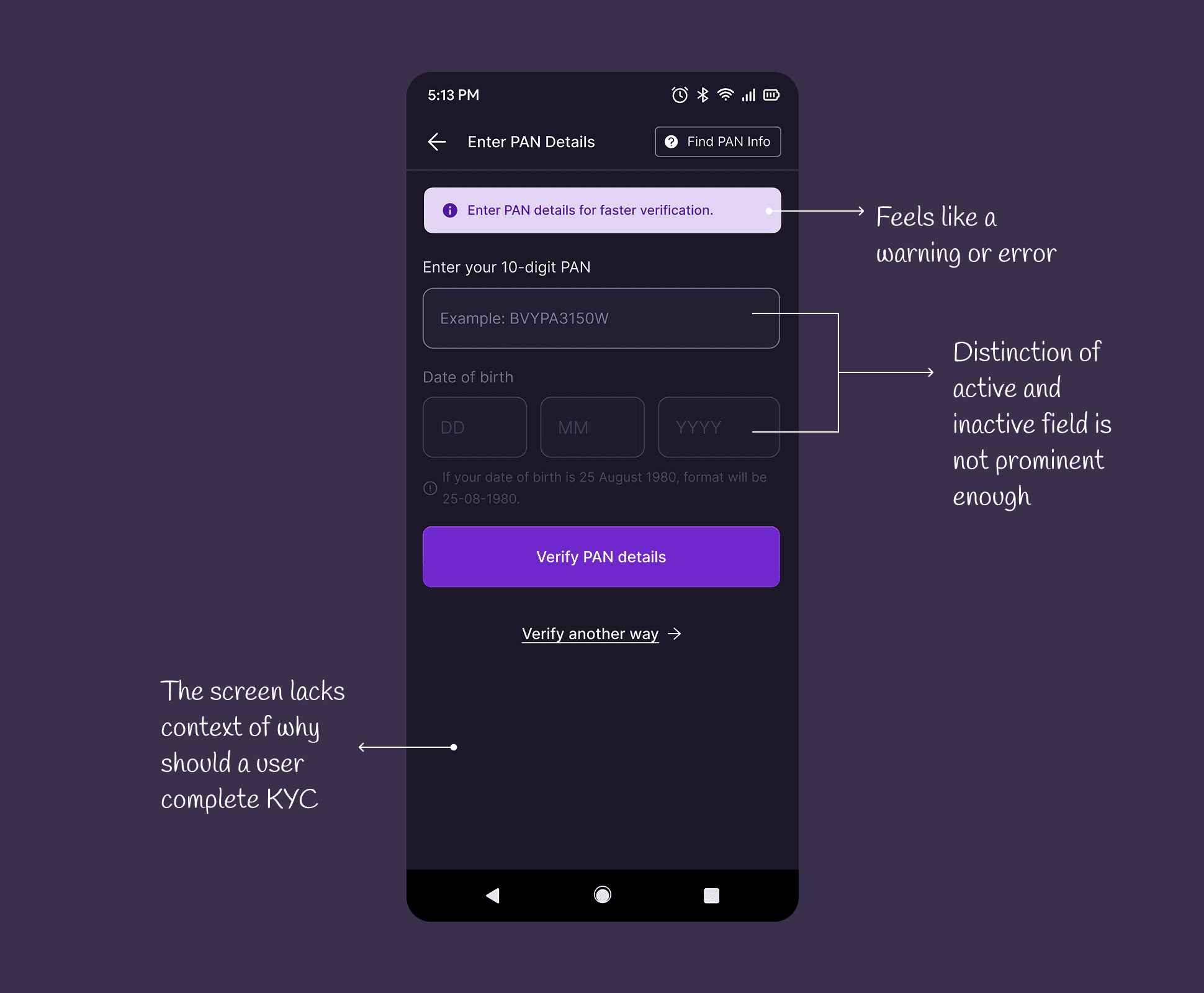
Audit Findings
The KYC page did not explain why verification was required
Multiple inputs were shown upfront, causing confusion
“Verify another way” required users to make multiple decisions at once.

What We Changed
Added Context at the Right Moment
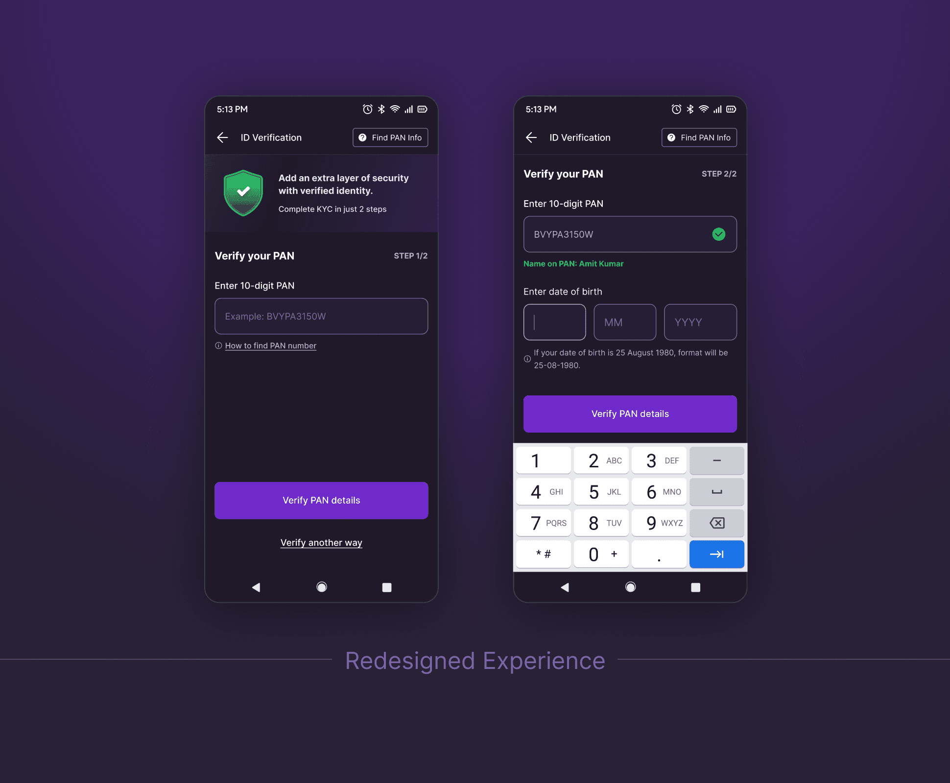
We introduced a banner on the KYC page explaining the importance of KYC and how it benefits the user, directly addressing the lack of motivation that existed earlier.Simplified the Primary KYC Flow
The original flow displayed both PAN and DOB fields together, even though the DOB field was disabled until PAN verification due to API constraints. This created confusion and false affordance. We redesigned this into a two-step flow.Reduced Cognitive Load in Alternate Verification
Previously, tapping “Verify another way” opened a page listing all document and capture options at once, forcing users to make multiple decisions simultaneously. We replaced this with a progressive bottom sheet flow.
Impact
Higher KYC attempt rates driven by better context
Improved completion through simplified, step-by-step flows
Reduced confusion and decision fatigue during verification
Other projects

Crafting a Cohesive and Scalable Icon System
Creating visually & optically balanced, intuitive icons that strengthen the product’s overall design language and improve consistency

Fixing a Hidden Friction Point in Payments
Eliminating redundant confirmations to create a more predictable, user-friendly bottom sheet interaction.